Layout
The Adapt design system provides layout guidelines for both mobile and desktop experiences, ensuring a consistent and responsive user interface.
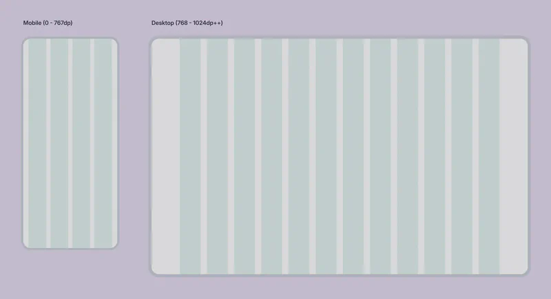
Layout Grids
Adapt uses a grid system to structure content and ensure visual consistency across different screen sizes. The grid system is based on the following specifications:
Mobile Layout (0px - 767px)
- Screen Width: 360px (used for design mockups)
- Margins: 20px (left and right)
- Gap: 16px between columns
- Columns: 4 columns
Desktop Layout (768px and above)
- Screen Width: 1440px (used for design mockups)
- Gap: 24px between columns
- Columns: 12 columns
Layout Principles
Adapt follows a specific layout methodology to enhance flexibility and maintainability:
Padding and Margin on Child Elements: Parent containers (sections, frames) generally do not have padding or margins. Instead, child elements define their own spacing. This allows for greater flexibility when rearranging sections and ensures consistent spacing regardless of the parent container.
Figma and Auto Layout: Designing in Figma with Auto Layout is strongly encouraged. Auto Layout streamlines the design process, making it easier to manage responsive layouts and maintain consistency.
Layer Naming: Clear and consistent layer naming in Figma is essential for collaboration and developer handoff. Ensure all layers are properly named to reflect their function and content.
Corner Radius
Consistent corner radii contribute to a polished and unified visual style. Adapt provides several options, accessible as Figma variables:
| Name | Value | Usage |
|---|---|---|
| None | 0px | Used when no corner rounding is desired. Typically used for elements that require a sharp, geometric look. |
| Extra-small | 4px | For subtle rounding on smaller elements, such as icons or small buttons. Use sparingly to avoid a “soft” or overly rounded appearance. |
| Small | 8px | A moderate corner radius for general use. Suitable for many UI elements. |
| Medium | 12px | A slightly more pronounced rounding, offering a softer visual feel. |
| Large | 16px | Preferred for most rectangular UI elements in Niyo’s aesthetic. Provides a good balance of visual interest and modern design. |
| Extra-large | 28px | Used for larger components like bottom sheets, modals, and dialogs, creating a distinct visual separation from the background. |
| Full | 1000px | Used for all buttons, creating a pill shape. This is a key differentiator for interactive elements. |
Using consistent corner radii helps establish a recognizable visual language and enhances the overall user experience. Refer to the Figma variables for these values to ensure consistency across designs.
Spacing
Adapt utilizes a spacing system based on an 8px grid. This ensures consistent spacing between elements and contributes to a harmonious visual rhythm. Available spacing values include:
- 0px, 4px, 8px, 12px, 16px, 24px, 32px, 40px, etc.
Using the 8px Grid:
The 8px grid provides a scalable and predictable spacing system. Multiples of 8 (or commonly used divisors like 4) should be used for margins, padding, gaps, and other spacing properties. This creates a consistent visual rhythm and helps align elements harmoniously.
Choosing Spacing Values:
Designers should use their judgment to select the appropriate spacing value based on the context and visual hierarchy:
- Smaller spacing (4px, 8px): Use for tighter groupings of related elements or within compact components.
- Medium spacing (12px, 16px): Suitable for standard spacing between most UI elements.
- Larger spacing (24px, 32px, 40px and above): Use to create clear separation between sections, emphasize visual hierarchy, or add breathing room around larger components.
Additional Layout Considerations
Responsiveness: While the defined grids provide a foundation, always consider responsiveness. Test your designs at various screen sizes within the defined ranges to ensure they adapt gracefully.
Accessibility: Ensure sufficient spacing between elements for users with motor impairments. Consider using larger touch targets on mobile devices.
Visual Hierarchy: Use layout to establish a clear visual hierarchy, guiding the user’s eye through the interface. Place important elements prominently and use spacing to create visual groupings.
Whitespace: Don’t be afraid to use whitespace effectively. Whitespace improves readability and creates a more visually appealing design.
Consistency: Adhere to the defined grid and spacing guidelines to maintain a consistent and harmonious layout throughout the application.