Standard Text Fields
Standard Text Fields, also referred to as Unformatted Input Fields, are versatile text input components that provide users with single-line or multi-line input options. They are suitable for a wide range of text-based inputs, including those that combine text and numerical characters.
Overview
Standard Text Fields are the most common type of text input in Adapt. They provide a simple and familiar interface for users to enter text. These fields are designed to be flexible and can be customized to meet the specific requirements of various input scenarios.
Variations
- Single-line: Allows users to input a single line of text. This is the default configuration.
- Multi-line: Allows users to input multiple lines of text, expanding vertically as needed.
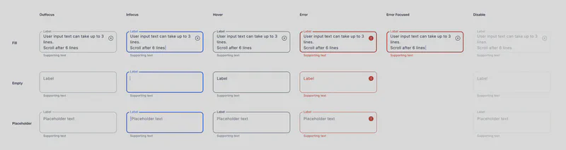
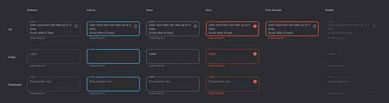
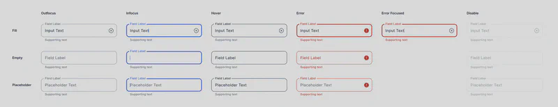
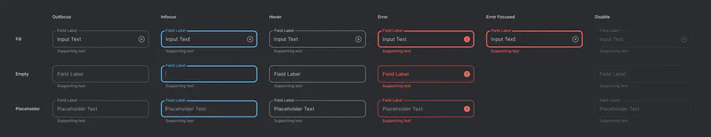
States and Styling
Standard Text Fields inherit the same states and styling as the Base Text Field component:
- Enabled/Outfocus
- Focused
- Hovered
- Error
- Error Focused
- Disabled
Usage Guidelines
- Labels: Always provide clear and concise labels.
- Error Handling: Display informative error messages to guide users.
- Accessibility: Ensure sufficient contrast and support assistive technologies.
- Placeholder Text: Use placeholder text strategically to provide hints or examples of the expected input format. Avoid using placeholder text as a replacement for labels.
- Input Type: Use the appropriate HTML input type attribute (e.g.,
text,email,tel,number) to specify the expected input format and enable relevant keyboard features on mobile devices. - Multi-line Input: Use the multi-line variation for longer text inputs, such as comments or descriptions. Limit the maximum number of characters or lines as needed.
Customization
Standard Text Fields can be further customized for specific use cases:
- Input Validation: Implement validation rules based on the expected input format (e.g., email, phone number).
- Character Limits: Set maximum character limits for single-line fields.
- Input Masking: Apply input masking to guide users on the expected format (e.g., phone numbers, credit card numbers).
- Helper Text: Provide helper text below the field for additional instructions or context.