Partitioned Input Fields
Partitioned input fields are specialized text fields divided into a fixed number of character or digit slots. This visual partitioning clearly communicates the required input length to the user. Adapt provides specific configurations tailored for OTP and passcode entry.
Configurations
- 4-digit input field without trailing icon: Use exclusively for 4-digit OTP entry. Do not use for passcodes.
- 6-digit input field without trailing icon: Use exclusively for 6-digit OTP entry. Do not use for passcodes.
- 4-digit input field with trailing icon (hide/unhide): Use exclusively for 4-digit passcode entry. Do not use for OTP or inputs of different lengths. The trailing icon toggles visibility of the entered characters.
- 6-digit input field with trailing icon (hide/unhide): Use exclusively for 6-digit passcode entry. Do not use for OTP or inputs of different lengths. The trailing icon toggles visibility of the entered characters.
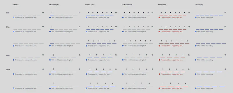
States (with Hide/Unhide Status)
The following states apply to partitioned input fields, with variations for the visibility (hide/unhide) status when a trailing icon is present:
| State | Hide Icon | Show Icon | Description |
|---|---|---|---|
| Outfocus | Visible | Hidden | Default state when the field is not focused. Characters are hidden. (Passcode fields only) |
| Infocus Empty | Visible | Hidden | The field is focused, but no input has been entered. Characters are hidden. (Passcode fields only) |
| Infocus Filled | Visible | Hidden | The field is focused, and some characters have been entered. Characters are hidden. (Passcode fields only) |
| Outfocus Filled | Visible | Hidden | The field is not focused, and it contains some characters. Characters are hidden. (Passcode fields only) |
| Error Filled | Visible | Hidden | The field contains an invalid input. (Error state overrides hide/show) |
| Error Empty | Visible | Hidden | The field is empty and marked as invalid. (Error state overrides hide/show) |

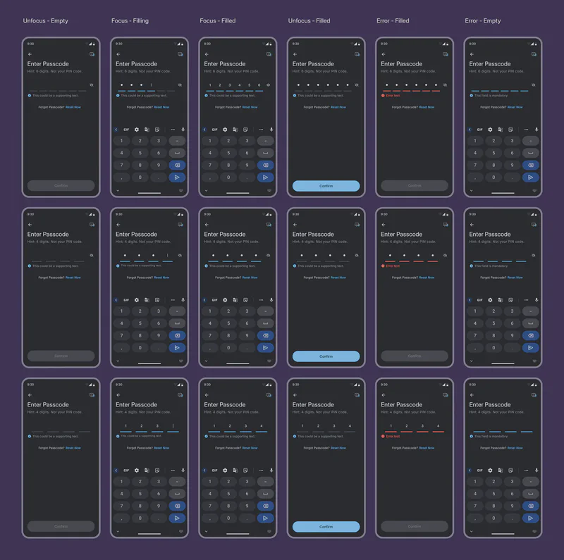
Behavior
- Field Label: The label for partitioned input fields is an integral part of the UI and should always be present.
- Focus: Tapping on a partition focuses the input field. Tapping outside the field removes focus.
- Cursor: A cursor should be visible when the field is in focus and hidden when it’s not.
- Error State: The error state color (typically red) reverts to the default color as soon as the user starts editing the value.
- Show/Hide Button: The visual appearance of the show/hide icon button (for passcode fields) remains consistent across states; only the icon itself changes (hide/show).
- Autosubmit: If autosubmit is enabled, validation initiates as soon as the last digit is entered, and the cursor and keypad collapse.
- Manual Submit: For manual submission, entering the last digit does not affect the cursor or keypad.
- Empty-Error State & Scrolling: If the user attempts to submit with an empty required field, the error state is displayed, and the page automatically scrolls to bring the field into view.
Usage Guidelines
- OTP vs. Passcode: Strictly adhere to the designated usage for OTP and passcode fields. Do not mix these use cases.
- Input Length: Ensure the chosen configuration matches the expected input length (4 or 6 digits).
- Error Handling: Provide clear error messages when invalid input is detected.
- Accessibility: Ensure sufficient contrast and consider users with visual or motor impairments.