Text Fields
Text fields allow users to input text. Adapt’s text field implementation builds upon the Material 3 Text Field, offering a streamlined set of styles and configurations optimized for Niyo’s design language.
Base Text Field
The Base Text Field component serves as the foundation for all other text field variations within the Adapt design system. It provides a consistent structure and behavior, allowing for customization to meet specific input requirements (e.g., First Name, Amount, Account Number). This section focuses solely on the behavior and appearance of the Base Text Field.
Key Differences from Material 3:
Adapt exclusively utilizes the outlined variant of the text field for a clean and consistent visual style. Filled and standard text fields are not used within Niyo’s implementation.
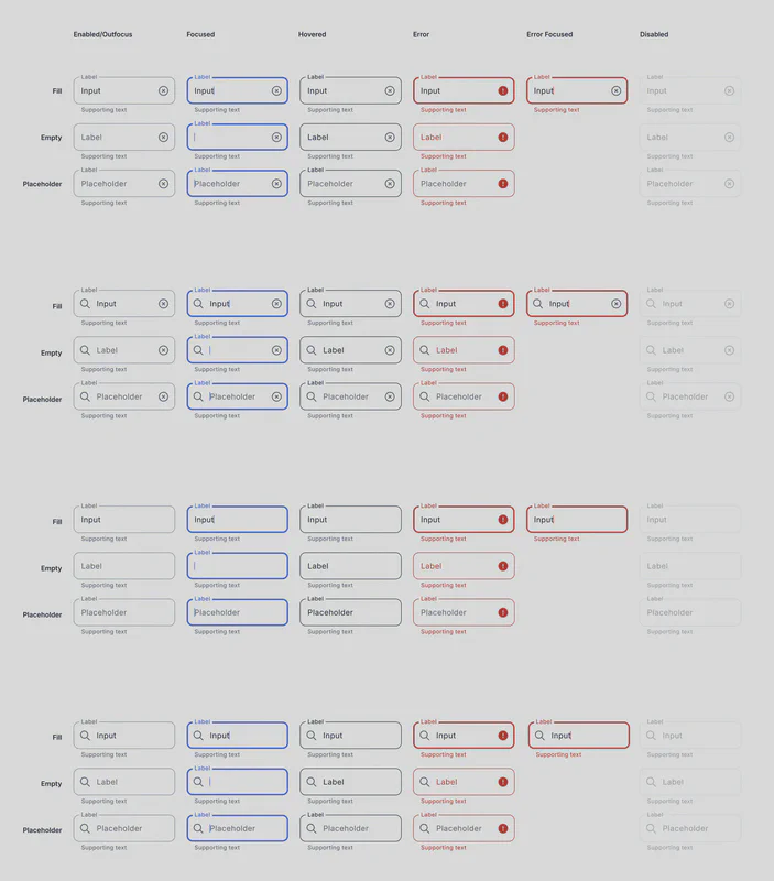
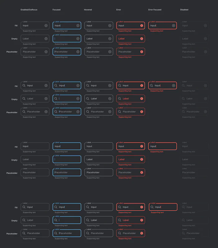
States
The Base Text Field supports the following states:
- Enabled/Outfocus: The default state of the text field when it is not actively being interacted with.
- Focused: The state when the user has tapped or clicked into the text field and is actively entering text.
- Hovered: The state when the user’s mouse pointer hovers over the text field (desktop only).
- Error: Indicates that the input provided by the user is invalid. A clear error message should accompany this state.
- Error Focused: The state when the text field is in an error state and is also focused.
- Disabled: Indicates that the text field is not currently usable and cannot be interacted with.
Text Configurations
The Base Text Field can be configured with the following text variations:
- Fill: The text field contains user-entered text.
- Empty: The text field is empty and awaiting user input.
- Placeholder: Displays placeholder text within the text field to guide the user on the expected input format or type.
Styling and Appearance
Usage Guidelines
- Labels: Always provide a clear and concise label above the text field to indicate the purpose of the input.
- Error Handling: Display clear and helpful error messages when the user enters invalid data. The error message should explain the issue and guide the user on how to correct it.
- Accessibility: Ensure sufficient contrast between the text field and its background. Use appropriate labels and error messages to support users with assistive technologies.
- Placeholder Text: Use placeholder text sparingly and ensure it provides meaningful guidance. Avoid using placeholder text as a replacement for labels.
Customization
While the Base Text Field provides a standard structure and appearance, it can be customized to create specific input types. This customization should primarily focus on:
- Input Validation: Implement appropriate validation rules based on the expected input type (e.g., email address, phone number, date).
- Input Masking: Use input masking where appropriate to guide the user on the expected input format (e.g., phone numbers, credit card numbers).
- Helper Text: Provide helper text below the text field to offer additional context or instructions.