Buttons
Buttons allow users to take actions, and make choices, with a single tap.
Adapt’s button implementation is based on Material 3, with a few additions tailored to Niyo’s specific needs. Understanding the different button types and configurations will help you choose the right button for the right context.
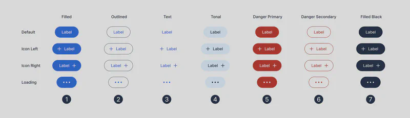
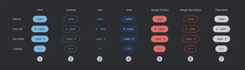
Button Types
(1) Filled: Use for primary actions or main entry points within a screen. Filled buttons attract user attention and encourage interaction. Adapt offers two variations of filled buttons (choose one based on the use case, but avoid using both together on the same screen):
- (1) Filled Brand: Uses the primary brand color to highlight key actions and reinforce branding.
- (7) Filled Black: Use for primary actions in simpler flows or less emotionally charged contexts (e.g., “Continue,” “Yes”). Provides a strong visual cue without the added emphasis of the brand color.
(2) Outlined: Use for secondary actions or options that are less prominent than primary actions.
(3) Text: Use for actions that don’t require strong visual emphasis, or within dense layouts where visual clutter should be minimized.
(4) Tonal: A button with a subtle background color. Offers a middle ground between Filled and Outlined buttons, providing visual distinction without being overly prominent.
(5) Danger Primary: Reserved for destructive actions (e.g., deleting data, irreversible operations). The strong visual cue warns the user of the potential consequences.
(6) Danger Secondary: A less prominent destructive action button for situations where the consequences are less severe or where a secondary confirmation is present.
Button Configurations
Each button type is available in the following configurations:
- Default: The standard button configuration without any icons.
- Icon Left: An icon is placed to the left of the button text. Use for actions with clear iconography.
- Icon Right: An icon is placed to the right of the button text.
- Loading: Displays a loading animation within the button. Use when an action requires processing time (e.g., submitting a form, loading data). Provide clear feedback to the user that the action is in progress.
Button Large
The Button Large component is identical to the standard Button component in terms of types and configurations but has a larger size.
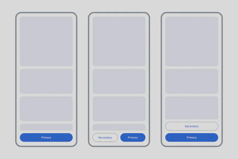
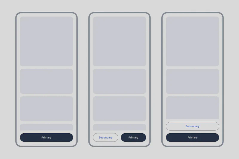
- Intent: Use Button Large for prominent primary actions, especially at the bottom of the screen on mobile layouts. The increased size draws attention and makes it easier for users to tap.
- Fill Frame: When used at the bottom of the screen, Button Large should typically fill the entire width of the screen (in mobile layouts). This creates a clear call to action and improves usability. (Refer to attached image for use case examples.)
The different button types, configurations, and the distinction between Button and Button Large, you can create effective and consistent user interfaces that guide users towards desired actions. Always consider the context and visual hierarchy when choosing a button style.